Andrea Limauro. Red Sun Arrival II, detail. Acrylic and metal leaf on canvas, 36 x 24 in. 2019. Courtesy of WAS gallery.
Limauro’s strokes remind me of the slow buildup of henna designs, or eyelet lace, silver sequins in a fan pattern on a sari. “Sweet Escape” 48”x48,” takes on a completely different approach to seascapes. The waves ground the composition in an aqua series of half fans, and the horizon line is a low, red land. With so many small strokes, like grains of rice, I’m compelled to continue noticing the environment. After several minutes looking at “Sweet Escape,” the pointed brush strokes of the waves and land start to make me think of many souls, striving to get somewhere, but neither the sea nor land are safe. Cresting the land, a volcano curves upward and instead of an eruption, a gilded sun bursts its rays out of the cupola. The rays pierce golden roads up through the topographic-lined clouds, and onto the only solid paint of the natural landscape – the blue-violet sky.
Across from “Sweet Escape” is the tropical “After They Left.” It is far more red than green, showing a lifeblood to an untouched – or a battlefield – jungle. The plants are all recognizable from photos or Hawaiian shirt prints, with leaves in greens, yellows, blue, orange. With so much red, I cannot decide who is bleeding. Is it the land, those who continue to live there, or those who left? And I like wondering if who “they” is – the colonizers, wildlife, explorers, or migrants?
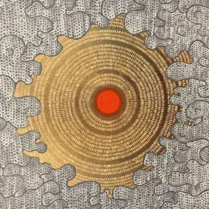
Limauro’s tiny strokes continue even in the small paintings (‘Mini Red Sun,” “Mini Sun”). The small panels also focus on a sparse environment with a close view toward the sky, red or golden center. The clouds strive toward the center and look like crocheted mounds, or coral calicle. It is clear that the landscape has become an icon through the liberal use of gold. Rather than a Byzantine Jesus, Sun is the calm place for all the eyes to find.
Two other large canvases provide a clearer narrative, with black and white images collaged in. In “Mare Nostrum,” (“our sea” in Latin) waves billow like a free-form quilt, hand-stitched. The waves build in the sale scallop, calicle stroke of works like “Mini Sun,” and adrift on them, are humans. Images of fishing boats, stranded rubber boats, planes, overboard people and an overturned boat. Clouds and smoke intermingle. Each figure has a gilded stroke on them, as if they are almost going to be okay. These stranded people are migrants, with insignificant rubber boats to their rescue. The waves take up 75% of the composition, to show how unending it is to cross an ocean in a tiny boat. The next, “Fourth Punic War” is a reference to the 21st century. The Third Punic War destroyed Carthage in 146 BC – all of these wars are for footing (or leverage, by Archimedes), of the same bit of land – Italy, Sicily, Northern Africa. The Fourth War is the migrant struggle to pass the sea. All the ships in the painting are from antiquity; a lone male lion stands in Carthage, the Colosseum tacks up half of Italy’s boot, gold land, and the sun is doubled, like so many Egyptian crowns, small and with rays spreading into the ocean and up the sky. It includes copper leaf in with the gold – maybe to show how the wealth of gold tarnishes, or that even copper is seen as valuable now.
A film, “Club Med,” plays in a room. In it, a rescue boat of migrants is juxtaposed against a cruise ship. If the narrative is too decorative to interpret from the paintings, reality is revealed here. Americans see the Mediterranean as tourism, a pleasure cruise with endless food and entertainment. This is an advertisement we are accustomed to. We don’t remember Roman naval battles, or Poseidon dashing Odysseus’ ships apart on a rocky island. To cross the Med as a migrant, though, is dangerous. Food is a luxury, comforts are banished, and death is very near. As a viewer, I am immediately empathetic to how hard the migrant struggle is, and I’m repulsed by the cruise goers. Odysseus only wanted to get back home; the migrants only want to find a home, and land is nigh unattainable.
There is nothing easy in the journey. Limauro said, “Things are not going well. People are dying. It’s the most dangerous migration route in the world,” and confirms for me that the brush strokes are eyes, either open or closed.
Leclere’s work also uses a macro view, but it also masters urban cartography. I can easily imagine people walking around in his compositions. But these people are all far away, or tiny, cast in a larger setting. “Face the Crowd” looks like a star, bursting apart in trapezoid projectiles, each piece attached to the wall. In another installation, it would be different – more compressed or extended, or painstakingly laid out the same way. Natural materials, black and white paint take up the compositions. Wood breaks out, cast aside like so many scraps. And they are scraps. Like forgotten people, Leclere collected the scraps to give them a purpose. They puzzle together a new architecture, and some hint at rivers, sea edges, and are frames by more angles and outlines geometric shapes.
“Springtime Explosion” is Leclere’s largest, with sculptural framing elements within the painting. But there is no color – no young greens, or even pale pink. Nothing cheerful. So, how does the title work? They key is “explosion.” He says, “In a good neighborhood, springtime is home. In a bad neighborhood, (spring) is when chaos and trouble come out.” I heard this same idea recently – in a bad neighborhood, spring is when violence bursts out. The social and physical structures of your environment affect your mindset. Violence is the people’s spring. “Springtime” is hope; where you find your hope, when the architecture that surrounds you is so oppressive and counter to new growth.
Leclere keeps a rawness to his minimalism. Raw canvas, charcoal, white, and black. The older, least defined shapes are soft gray, like half memories or peripheral vision. Sometimes, clear linear connections rise to the top, proving congestion and population. His very own chaos and strict tensions are bold in white and black and form a new balanced order. Packing, unpacking, redefining spaces in an urban environment, with stray river line fragments helping to define the borders. At some points, smudges collect and collide to take on a real touch, like they were bodies or thumb prints.
I think that he’s getting somewhere, breaking free of the painting’s cartography when he adds these wood scraps, which scatters and changes the highlights in his shapes. There is a sense of trajectory – whether it is from the wood, breaking up the picture plane, or gaining control in what you remember. I think the inhabitants are changing their landscape.
Liz Ashe
WAS Gallery/ “Journey Still” Andrea Limauro and Arnaud Leclere
Volume 33 no 5 May /June 2019