 I did not go there looking for Titian and I didn’t find him. Instead I saw an intelligently curated show that presented some of the best printmaking of our time, interesting support pieces, and a model that sheds light on the American art scene since we declared ourselves non-inferior to Europe (c. 1962). If the ‘60s are compared to the sparkling headwaters of the Mississippi, then today’s art scene is like its delta: wide, shallow, teaming with life, much of it less than elegant, but madly diversified and not without its pleasures.(1) “The Expanded Print” covers both ends.
Warhol, Rauschenberg, LeWitt, Rosenquist, Serra, Stella, these are many of the seminal figures, the artists who sowed their creative oats without making any apologies to the European tradition and all it had accomplished. They jumped from one seemingly transgressive affront against it to another, peripatetic always, successful in delivering the pleasures unique to art, sometimes – both despite and because of their impudence and disregard.
LeWitt’s “Wall Drawing #1097”, composed of 50 nails randomly placed on a wall then connected with string, fails to deliver much more than a high class do-dad for the luxury trade, full of confounding theory and the “profundity” that many associate with that stuff. But pleasure? Well, it’s not ugly, and it embodies a gesture against convention that is mildly interesting.
“Wall Drawing 98”, on the other hand, is both more confounding and more satisfying. It denies most of the traditions of picture making, save the bounding rectangle, and even then confuses the issue by providing a pair of them, a duality that divides. Yellow lines galore, 10,000 in each rectangle, cause the white wall to glow when seen from a typical distance for looking at pictures. But they drew me in, sucked me in, actually, until I was a scant foot from one of the squares. Instead of a unified picture I saw a relaxed, infinitely expanding field of vague yellow things triggering pleasure centers I had not experienced before, even though they did generate the familiar feeling of Wittgenstein’s clicking of the clicker.
European codecs for making a successful picture demand that it resolve itself into a unity, sometimes said to constitute a whole that is greater than the sum of its parts. In this drawing the parts are just parts, and it does not matter exactly where you decide to view them from 12 inches out, as long as you don’t get too close to the edge. Nor does it matter whether I choose the straight lines on the right or the non-straights on the left.
Compared to the string that doesn’t deliver, the yellow lines work just about anywhere and everywhere. They are impudence that gets somewhere, impudence that delimits in favor of a certain direction because it works better than its alternatives. In one way it is the work of every successful artist of every time, but in another, it is specific to America sticking it to Europe. LeWitt was not a nihilist, as many regard Duchamp. He was just a new kid on the block who had something to say. He sacrificed the whole to maximize the effect of its parts. When that succeeds, watch out.
Then there is Rauschenberg. Aristotle observed that successful theatre always has a beginning, middle and end, as does all storytelling. Like the LeWitt, the Rauschenberg performance satisfies best when dipped into and exited. It was not required to pick a specific time for entry, just that I didn’t indulge too long and extend into boredom. “Open Score” is refined, stately even, viewed within that circumstance. It is not anything like the stupid things the Dadaists did. But it is everywhere in the middle of something, even the technical start and end. Re-entry at different points worked every time I tried it. Rauschenberg was doing “time-based” art before we had a term for it, and he showed that he could use a rebellious methodology and be aesthetically successful.
The show also includes “Booster”, Rauschenberg’s most famous print. It leaves no doubt the man could hold his own with the whole-must-be-greater-than-the-sum-of-its-parts crowd. It also leaves no doubt that the new American effort was much more than hanging a negative sign on everything Europe had accomplished.
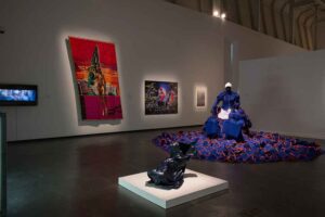
When I noticed the litho version of Rosenquist’s “F-111”, up I went to see if the illustrative wizardry of the painting was there. Of course it was. In all 30 feet of it. But the thing made me back up, further and further, so that most of the illustration was gone, save the hair dryer. The coldly neutral rendering gave way to a rush of warm, compelling color, the stuff that made Renoir’s pictures of women and flowers so sumptuous, but without the personalized surface, almost without any surface at all. Oh wow. Really.
Serra is represented by “183rd & Webster Avenue”, a mass of vague and diffuse black entities bound to a flattened circle and strongly attached to the corners of the page, then printed via traditional lithography. It was based on his first outdoor installation in a seedy area of the Bronx, a steel circle embedded into the street, a not so traditional method of making sculpture. Tusche wash drawings, such as this one, are challenging to make because the pigment that guides the artist’s eyes tends to disperse much more evenly than the grease that determines how the image will print. But the requisite mastery is there, in excelsis, in the case of Serra. And by that I mean ability to draw, not simply to print. To draw well, the artist must both understand what is going on with the tusche and maintain the discipline necessary to deal with it, then impose his artistry itself. “183rd & Webster Avenue” was good to look at. It could have been done by an earlier European, it just wasn’t.
These artists were not Titians, but they were relentless in starting provocative fires to signal the new American confidence, confidence even more sure footed than that found in the original New York School. What became of all their joy and juice?
Deborah Kass’s “Diamond Deb” is what the up-to-date crowd calls “appropriated”, a word they use in place of “derivative”. Such nomenclature is the result of what Miklos Legrady describes as the migration of the art world from the Cedar Street Tavern to the seminar room. There was only one Cedar Street Tavern, frequented by just a few intensely focused, elitist, narrow minded, independent, combative, and highly judgmental artists. Those who immediately followed were similar. Richard Serra famously summarized this approach: “Art is not democratic. It is not for the people.” (2) Today there are thousands of seminar rooms, most of them filled with people all saying the same things about contemporary art, relaxed in the assurance that comes when you know so many others agree. Our current scene is the delta stage for what the artists of the ‘50s, ‘60s, and ‘70s initiated. It is inclusive and expansive rather than exclusive, permissive rather than choosy, decompressed rather than focused, easy to get rather than difficult. It carries the self-assurance that originated in the headwaters to full realization, but with a much different outcome. There is lots of stuff going on everywhere, something for everyone. It commands the interest of the widest possible audience, via quasi-confounding sensationalism and well-explained “novelty”. It is very good at what it does. Never before have there been as many contemporary artists as we have today. Never before has the work of living artists commanded the prices it does now.
“Diamond Deb” decorates the bones of Andy Warhol with glitter that Warhol himself would approve, if not copy. It turns on the viewer’s assumed knowledge of Warhol’s method, which is quite a safe assumption today. As an experience, “Diamond Deb” is shallow, flashy, derivative, and not all that bad to look at. It stands up to a couple of re-looks, for sure. Perhaps more if you are attending a seminar on Warhol. It is put together nicely and is a perfect illustration for both the term “appropriated” and “derivative”.
Deltas are inflection points. They are both where a mighty river goes to die and where something else begins. Kass’s print instantiates elements from both. It is best looked at in a much more traditional mode than much of the work from the ‘60s and ‘70s upstarts. In that manner it is a signal for something that might lurk where the delta is dissipating. Appropriation just isn’t as confounding and new as it once was. But the glittery diamond dust image goes down rather smoothly as itself, presented in a framework that has characterized portraiture for centuries. That is good. Warhol once said he collected the artists Clement Greenberg liked. Kass’s print can be looked at in that light without negating its claim to be an appropriation.
ENDNOTES
1. For an extended discussion of the headwaters versus delta metaphor go to Franklin Einspruch’s Artblog (http://www.artblog.net/post/2006/12/basel/). The discussion begins at comment 70.
2. Quoted in Sean O’Hagen’s “Man of Steel” (https://www.theguardian.com/artanddesign/2008/oct/05/serra.art)
THE EXPANDED PRINT: WMU’s Collection in Context September 14 – October 22, 2017 Curator: Dr. Indra Lacis, Richmond Center for Visual Arts Western Michigan University, Kalamazoo, Michigan
John Link is a contributing Editor to the New Art Examiner
Volume 32 no 3 Jan/Feb 2018 pp 25-27
Great terms for my daily inspirational meditation: “appropriated” and “derivative”. Have they slightly run out of ideas?
Hannah, I actually approve of what many call derivative art. Morris Louis, for instance, derived his stain pictures from seeing Helen Frankenthaler’s work, just as Deborah Kass derived her sparkly print from Andy Warhol. The kicker, of course, is the derivation has to be good enough to enjoy on its own. That said, I see no magic in using the word “appropriation” to indicate that derivation is something new and revolutionary. It has been done, and done successfully, for centuries.
Your fantastic description of LeWitt’s “Wall Drawing #1097” made me look it up, as I couldn’t resist your barb of it not being “much more than a high class do-dad for the luxury trade, full of confounding theory and the “profundity” that many associate with that stuff.” How well put! And the fact that it wasn’t ugly made it even better. Thank you for the fun and interesting read.
Quentin,
You are welcome. Not all things done by a good artist are good. In fact, it seems that making bad stuff is part of the process of getting really good ones. This show and its two wall pieces by LeWitt provided yet another example of how that seems to operate.
We seem to have one, two, three…
Artists we copy, “derivative” certainly is no exaggeration.
Identification Complex?
I drove into Pittsburg to the Warhol Museum on my way the Steelers were playing around the corner.
I made 3 seriographs there thanks Andy.